This is how to show message alert notification boxes styled with CSS. First copy the CSS, then use the HTML to show whichever notification message you want to show. This page has the HTML for eight different styles of notifications.
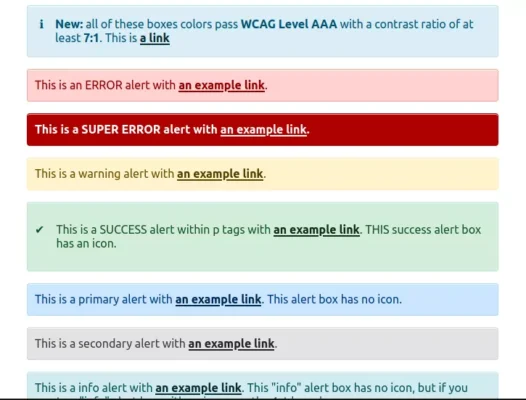
Accessible color contrast is level AAA for all of these alert boxes. These box colors pass the WCAG Level AAA with a contrast ratio of at least 7:1.
The style of these message boxes doesn’t have a box-shadow, but if you prefer a box-shadow, see the variations below. There is also a variation for the info icon; you can use just the little “i” instead of the little “i” with a circle around it (icons are pure CSS).
To use message notification boxes, use this CSS:
CSS
.alert {
  padding: 12px 10px 9px;
  margin-bottom: 1rem;
  border: 1px solid transparent;
  border-radius: 0.25rem;
  box-shadow: inset 0 1px 0 rgba(255, 255, 255, 0.7);
}
.alert.alert-shadow {
  box-shadow: 0 1px 6px rgba(32, 33, 36, 0.28);
  border-radius: 8px;
}
.alert-primary {
  color: #004085;
  background-color: #cce5ff;
  border-color: #b8daff;
}
.alert-secondary {
  color: #383d41;
  background-color: #e2e3e5;
  border-color: #d6d8db;
}
.alert-info {
  color: #07525e;
  background-color: #d1ecf1;
  border-color: #bee5eb;
}
.alert-info-icon {
  color: #00516f;
  background-color: #d9edf7;
  border-color: #bee5eb;
  display: flex;
  align-items: baseline;
}
.alert-success {
  color: #125522;
  background-color: #d4edda;
  border-color: #c3e6cb;
  display: flex;
  align-items: baseline;
}
.alert-success .alert-link {
  color: #0b2e13;
}
.alert-success:before {
  content: "\2714";
  padding-right: 16px;
}
.alert-warning {
  color: #6a4d00;
  background-color: #fff3cd;
  border-color: #ffeeba;
}
.alert-error {
  color: #900000;
  background: #ffd2d2;
  border-color: #f1a899;
}
.alert-super-error {
  color: #fff;
  background-color: #ae0000;
  font-weight: 600;
}
.alert-link {
  font-weight: 700;
  text-decoration: underline;
}
.alert-primary a {
  color: #002752;
}
.alert-secondary a {
  color: #202326;
}
.alert-info a,
.alert-info-icon a {
  color: #062c33;
}
.alert-success a {
  color: #0b2e13;
}
.alert-warning a {
  color: #533f03;
}
.alert-error a {
  color: #900000;
}
.alert-super-error a {
  color: #fff;
}
.alert-success p,
.alert-info-icon p {
  margin-top: 0;
  margin-bottom: 0;
}
.alert-info-icon:before {
  padding-right: 16px;
  content: '\24D8';
}
The HTML To Show The Message Boxes:
In each sample, replace line 2 with your own message.
1. Pink Error Alert Box
No shadow:
To show it, use this HTML:
HTML
<div class="alert alert-error" role="alert">
    This is an ERROR alert with <a href="#" class="alert-link">an example link</a>.
</div>
With box shadow:
To show it, use this HTML:
HTML
<div class="alert alert-shadow alert-error" role="alert">
    This is an ERROR alert with <a href="#" class="alert-link">an example link</a> and a shadow around the box.
</div>
2. Red Super Error Alert Box:
No shadow:
To show it, use this HTML:
HTML
<div class="alert alert-super-error" role="alert">
    This is a SUPER ERROR alert with <a href="#" class="alert-link">an example link</a>.
</div>
With box shadow:
To show it, use this HTML:
HTML
<div class="alert alert-shadow alert-super-error" role="alert">
    This is a SUPER ERROR alert with <a href="#" class="alert-link">an example link</a>.
</div>
3. Yellow Warning-message Box:
No shadow:
To show it, use this HTML:
HTML
<div class="alert alert-warning" role="alert">
    This is a warning alert with <a href="#" class="alert-link">an example link</a>.
</div>
With box shadow:
To show it, use this HTML:
HTML
<div class="alert alert-shadow alert-warning" role="alert">
    This is a warning alert with <a href="#" class="alert-link">an example link</a>.
</div>
4. Blue Primary Alert Box:
No shadow:
To show it, use this HTML:
HTML
<div class="alert alert-primary" role="alert">
    This is a primary alert with <a href="#" class="alert-link">an example link</a>. This alert box has no icon.
</div>
With box shadow:
To show it, use this HTML:
HTML
<div class="alert alert-shadow alert-primary" role="alert">
    This is a primary alert with <a href="#" class="alert-link">an example link</a>. This alert box has no icon.
</div>
5. Lighter Blue Info Alert-message Box, No icon:
No shadow:
To show it, use this HTML:
HTML
<div class="alert alert-info" role="alert">
    This is a info alert with <a href="#" class="alert-link">an example link</a>. This "info" alert box has no icon, but if you want an "info" alert box with an icon, use the next box below.
</div>
With box shadow:
To show it, use this HTML:
HTML
<div class="alert alert-shadow alert-info" role="alert">
    This is a info alert with <a href="#" class="alert-link">an example link</a>. This "info" alert box has no icon, but if you want an "info" alert box with an icon, use the next box below.
</div>
6. Blue Info Alert-message Box With “info” icon:
No shadow:
To show it, use this HTML:
(Note: because of the icon, this one needs the text to be wrapped in paragraph tags. This uses pure CSS to display the icon.)
HTML
<div class="alert alert-info-icon">
  <p>
    This is the info message. You can also add HTML here. <strong>Bold</strong>. This is <a href="#" class="alert-link">a link</a>
  </p>
</div>
With box shadow:
To show it, use this HTML:
(Note: because of the icon, this one needs the text to be wrapped in paragraph tags. This uses pure CSS to display the icon.)
HTML
<div class="alert alert-shadow alert-info-icon">
   <p>
      This is the info message. You can also add HTML here. <strong>Bold</strong>. This is <a href="#" class="alert-link">a link</a>
   </p>
</div>
7. Gray Secondary Alert Box:
No shadow:
To show it, use this HTML:
HTML
<div class="alert alert-secondary" role="alert">
    This is a secondary alert with <a href="#" class="alert-link">an example link</a>.
</div>
With box shadow:
To show it, use this HTML:
HTML
<div class="alert alert-shadow alert-secondary" role="alert">
    This is a secondary alert with <a href="#" class="alert-link">an example link</a>.
</div>
8. Green Success-message Box:
No shadow:
This is a SUCCESS alert within p tags with an example link. THIS success alert box has an icon.
To show it, use this HTML:
(Note: because of the icon, this one needs the text to be wrapped in paragraph tags. This uses pure CSS to display the icon.)
HTML
<div class="alert alert-success" role="alert"><p>
This is a SUCCESS alert within p tags with <a href="#" class="alert-link">an example link</a>. THIS success alert box has an icon.
</p></div>
With box shadow:
This is a SUCCESS alert within p tags with an example link. THIS success alert box has an icon.
To show it, use this HTML:
(Note: because of the icon, this one needs the text to be wrapped in paragraph tags. This uses pure CSS to display the icon.)
HTML
<div class="alert alert-shadow alert-success" role="alert"><p>
This is a SUCCESS alert within p tags with <a href="#" class="alert-link">an example link</a>. THIS success alert box has an icon.
</p></div>
Style Variations
-
CSS Style Variation: More Rounded Corners
If you want your message boxes to have more rounded corners, replace line 5 in the CSS code above with this:
border-radius:.5em;
-
CSS Style Variation: Square Corners
If you want your message boxes to have completely square corners, replace line 5 in the CSS code above with this:
border-radius: 0;
-
CSS Style Variation: Info Icon of Small Letter ‘i’
The info icon used above is the letter ‘i’ with a circle around it. If you prefer to instead use the icon that’s just the little “i” and no circle, which looks like this: ℹ
To use this info icon, in the CSS code above near the very end, replace this line:
content: '\24D8';
with this:
content: '\2139';
Ali
May 9th, 2012 at 7:02 am
Well done. i like it thanks
Craig
May 14th, 2012 at 12:00 am
Could you please give an example of the HTML you used to create the sample pictures? Thanks in advance.
Isabel
May 16th, 2012 at 11:46 pm
Sure. I added examples at the end of the article (see above). Thanks for stopping by.
codingforever99
January 18th, 2013 at 3:47 am
nice work, I think adding some jguery effects will be great.
Isabel
January 19th, 2013 at 6:44 pm
Thanks.
Davide
July 22nd, 2013 at 6:41 pm
Nice, I like it. Thanks Isabel!
I added a simple code to fade it out with jQuery:
La tua lista prodotti è stata aggiornata con successo!
$(document).ready(function(){
$(‘#updated’).fadeOut(3000);
});
Nick
April 26th, 2013 at 4:15 am
You’ve done a really lovely job with these, Isabel. Thanks for sharing them 🙂
Isabel
April 29th, 2013 at 5:11 pm
Thank you.
Luis
July 9th, 2013 at 8:10 am
Thanks!! nice tips! 🙂
Daniele
September 7th, 2013 at 10:40 am
Hi Isa,
Great info, just a note regarding the images!
The icons have different sizes, two of them are 32×32 and two are 128×128.
Thanks!
Isabel
September 7th, 2013 at 11:57 am
Thank you. I just fixed it. They should all be 32×32, now. Good eye!
Mario
September 12th, 2013 at 3:51 pm
Ty very much for this 🙂
HeartDisk
May 9th, 2014 at 3:11 am
Nice Work
Keep it Up
Omar Padilla
March 12th, 2015 at 10:47 am
Perfect. I’m going to use this. I for one like that you’re not using jquery. I try to avoid jquery at all costs and I wouldn’t want to import a big bulky library just for error/info messages.
Thanks
AB
May 17th, 2015 at 2:40 pm
Excellent work Isabel .Amazing..Keep up the good work !!!
Lucio
June 14th, 2015 at 6:09 pm
Nice job.
Thank you.
damith
May 30th, 2016 at 6:49 am
Thanks for this code
Kijana Woodard
July 22nd, 2016 at 10:31 am
Thanks for the code and thanks for *not* making an npm package out of this. 😉
Jamal
April 9th, 2017 at 9:39 am
hey, I just want to know how can i put the box on top of the form in the middle of page :O
Mic Slay
May 30th, 2017 at 11:46 am
You just saved me a lot of times with this and made it very easy to implement a small feature in an already existing codebase! Gracias!
Mic Slay
May 30th, 2017 at 11:47 am
“…saved me a lot of time…”*
Daniel
May 17th, 2018 at 9:13 am
Very complete and helpful. Thank you!
Abdellah
July 9th, 2018 at 11:42 am
Thanx
Irfan
September 7th, 2018 at 1:03 am
thanks
very nice and simple.